ASOS
Brand Identity
Art Direction
Photography
Packaging Design
Print Production
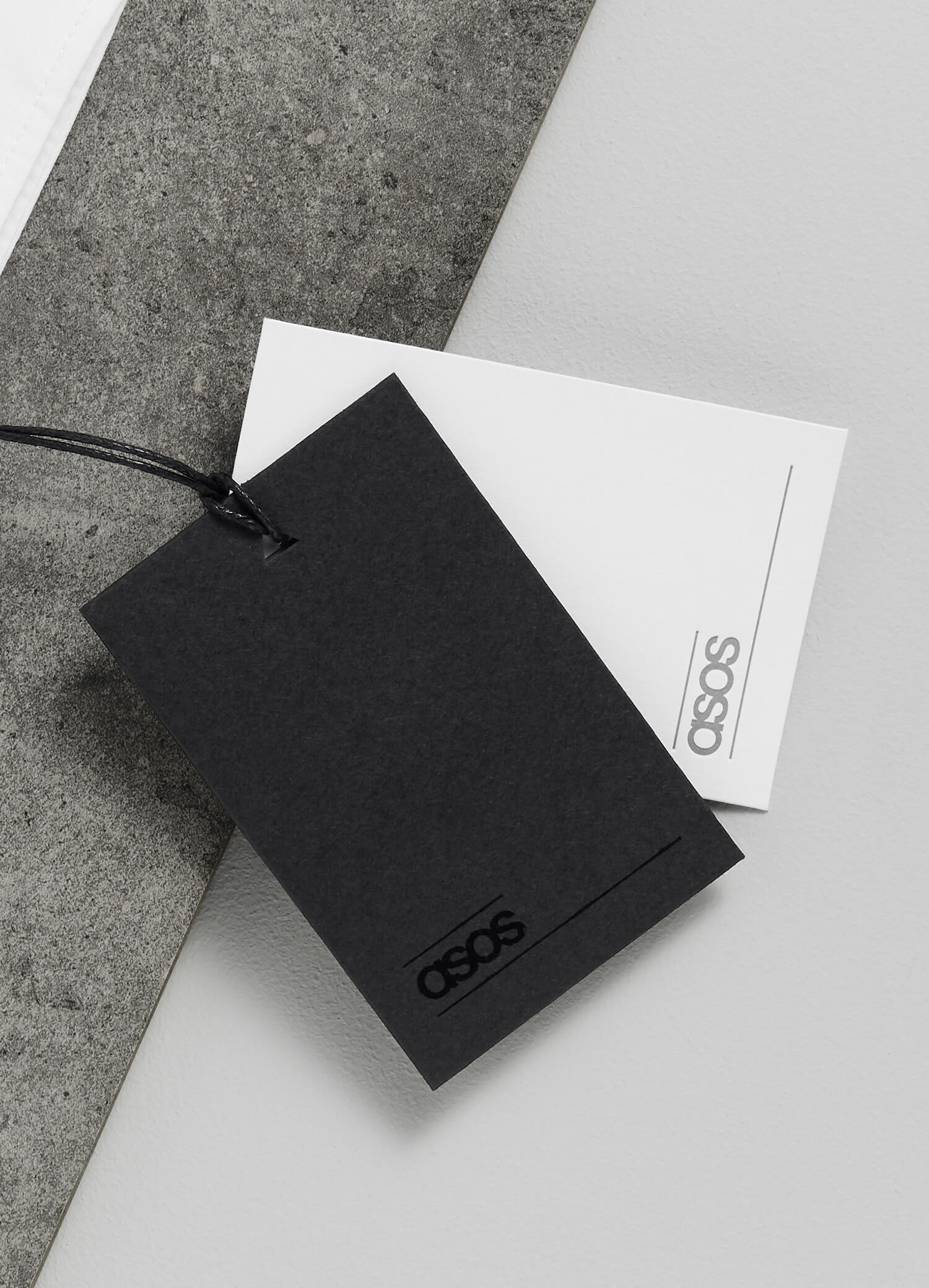
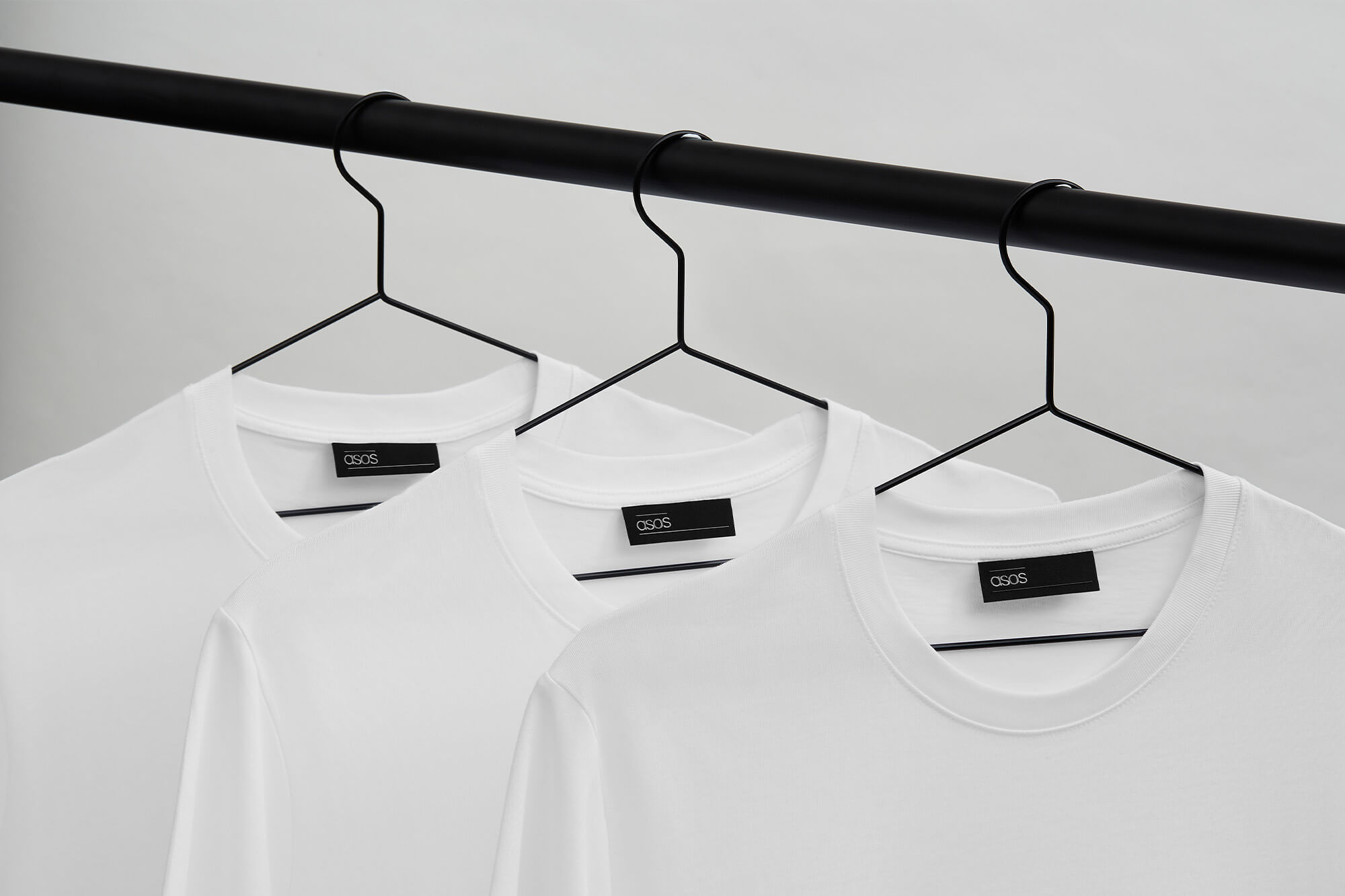
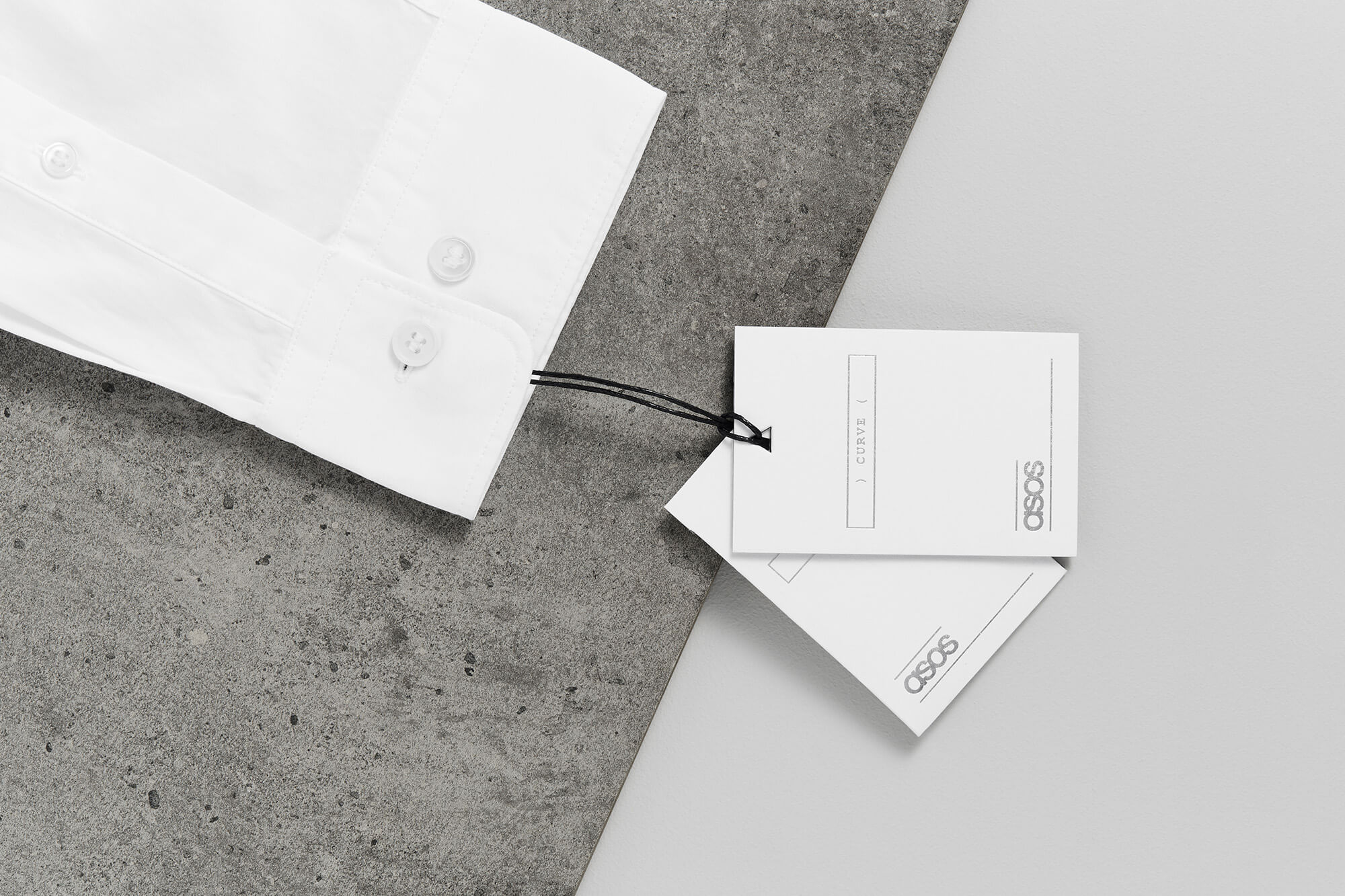
Marmalade carried out a full Branding and Packaging review for the global online fashion retailer, to generate a consistent visual system to align key departments. Brand elements such as the colour palette, which goes from brown paper through greys and white to a dark navy, has been applied across both menswear and womenswear to ensure synergy. Distinguishing collections such as petite, curve and maternity was achieved through a series of keyboard glyphs, inspired by ASOS’s e-comm heritage.
Shaping the on-product identity
of a global fashion retailer
ASOS
![](https://marmaladelondon.co.uk/wp-content/uploads/2020/01/ASOS-swing-tags-all-768x448.jpg)
![](https://marmaladelondon.co.uk/wp-content/uploads/2019/11/asos-swing-test-768x512.jpg)
![](https://marmaladelondon.co.uk/wp-content/uploads/2020/01/ASOS-icons.png)
![](https://marmaladelondon.co.uk/wp-content/uploads/2019/11/ASOS-woven-label-tshirt.jpg)
![](https://marmaladelondon.co.uk/wp-content/uploads/2020/01/ASOS-departments.png)
![](https://marmaladelondon.co.uk/wp-content/uploads/2020/01/ASOS-swing-tags-curve.jpg)
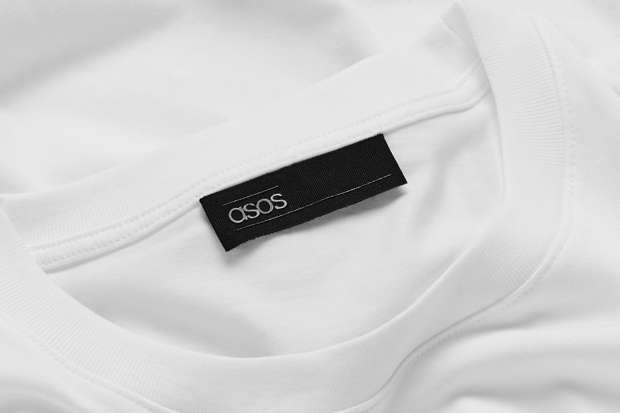
We employed consistency across all physical touchpoints
![](https://marmaladelondon.co.uk/wp-content/uploads/2020/01/ASOS-swing-tags-all-flat-768x448.jpg)
![](https://marmaladelondon.co.uk/wp-content/uploads/2020/01/ASOS-swing-tag-black.jpg)
![](https://marmaladelondon.co.uk/wp-content/uploads/2020/01/ASOS-woven-labels-tshirt.jpg)